Posted on June 21, 2017 by admin
The Guide to Mobile Technical SEO

With mobile users dominating the search engines year by year, it is no surprise that Google has put mobile searches a priority. Google is already experimenting with its mobile-first indexing from the last year and even though it is still unknown, but it is expected that mobile first index will be up and roll by the end of this year.
As the Mobile first indexing holds the future of the search engine, controlling ranking on both mobile and desktop website, there is the need for brands to adopt the mobile-focused approach to respond to quickly growing the mobile audience.
While, we have discussed the content and its implications in mobile first indexing, it is imperative to cater the technicalities and make the website consistent with mobile search. Here is a complete guide to help you understand what is technical SEO and how to do it, highlighting the mobile configuration and settings.
What is Technical SEO?
The technical SEO takes care of the interaction between crawlers and website, helping crawlers to understand the content of the website. In the simplest terms, technical SEO covers the coding and technical settings that allow search engines to access the information they need to understand the content.
What are the Types of Mobile Configuration?
There are currently three types of mobile configurations which are used to display webpages on the mobile devices.
#1- Dynamic Severing
Dynamic serving uses the user agent detection method to deliver unique experiences per the user agent requesting them. In simple terms, the dynamic serving uses HTML/CSS settings to access information about the user’s device and then delivers the webpage accordingly.
While the dynamic serving allows treating the users with unique and individual experiences, the user agent requests are prone to mistake, compromising overall user experience. There is no redirection required, but crawlers have to use different user agents which increase the crawl budget and lower its efficiency.
#2- Mobile Website
In the mobile website, there are separate URLs for mobile and desktop version of the website. You can choose a sub-domain of current desktop URL or can purchase a completely different domain to host the mobile website.
The user agents are used to determine whether traffic is coming from mobile or desktop, and the user is redirected to the relevant website.
While this system allows building rich mobile experience and mobile content, the redirection process can run into errors. It is also costly to maintain and optimize two websites.
#3- Responsive Design
The responsive design responds to the user environment scaling the design and content according to the user’s device. It uses CSS media queries to scale the webpage according to the screen size.
The responsive design includes only single URL for both mobile and desktop version and does not require user agent based redirection which reduces the number of errors. The single URL increases crawler budget and improves indexing efficiency.
However, if one version goes down, the other also goes down.
Which Mobile Configuration Should I choose?
Google recognizes all three mobile configurations, and its webmaster guidelines describe that Google does not favor any URL or page format unless all the elements of the page are accessible to crawler bot.
Nonetheless, the comparison of above three recommends the use of responsive design in which both URLs remain the same.
What Should I do to Improve Mobile User Experience?
As it is mentioned on Google’s Webmaster page that you should avoid doing things that can frustrate mobile users, the user experience is put at the core of mobile based indexing and ranking. As New York SEO company with strong technical expertise, here are the three things to emphasize in creating enriched mobile user experience with right technical settings.
#1- Speed of the Webpage
Speed is one of the essential ingredients of creating winning digital experiences. With 40% of visitors quitting the page if it takes more than 3 seconds to load, the speed of mobile website should be as fast as a bullet, epic and flawless. You can improve the speed of mobile webpages with these four techniques.
- Accelerated Mobile Pages (AMP): AMP does not indicate the page rank, but it improves the user experience by delivering super-fast mobile pages that load under 3 seconds. The AMP HTML markup makes the waiting time almost non-existent.
- Less is More: Avoiding loading your mobile webpage with anything that prolongs the loading time or crowds the page’s HTML or CSS code. One tip is to always use minimalistic elements and remove all non-essential elements.
- No Redirect Chains: Make it a strict rule to avoid long redirect chains. If you must redirect a page, make sure that it is done in one step rather than multiple steps. The redirect chains increase page loading time and may also result in more frequent errors. Audit your website and redirect all 404 pages through 301 redirect tool in one step.
- Using Browser Cache: When a website is opened, the device downloads some of the files to display the page correctly. Browser Caching allows website to store some of the its elements in the device when it is accessed for the first time, helping website to load quicker on the subsequent visits.
Browser cache can be enabled by contacting your host company and HTTP setting. You can set time for updating files and expiry of downloaded information. It also depends on the device’s cache settings.
#2- Site Architecture
While the speed of the website is an essential for smooth mobile user experience, the site architecture plays a critical role in allowing the user to navigate with ease. The mobile users want to access a page in less than three clicks.
These are some of the easy-to-follow techniques to help organize site architecture for seamless user experience.
- Breadcrumbs: Breadcrumbs is a secondary navigational scheme that tells the user where he is on the website and allows the visitor to go to previous pages or different pages in less than three clicks. It is laid as the secondary navigational hierarchy in addition to primary navigation to help users and bots to sail through complex site hierarchy or large e-commerce architecture.
Here is an example of how breadcrumbs are used in Amazon’s complex e-commerce store.

- Strong Internal Linking: Internal linking is another method that allows users and bots to get more information about the topics, read through the previous but relevant post, and to make sense of keywords. The internal linking improves the ranking of the keyword in search engine.
#3- Structured Data Markup
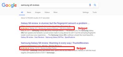
Structured data markup is used to enhance the credibility and authenticity of the website by enriching snippet views in Search Engine Result Pages (SERPs). For example, the snippets like user rating and extra information about the content or products tell users and bots about the page and increase click-through rates of the user. The rich snippets carrying the customer reviews and feedbacks have higher click-through rate.
You can use Google’s rich snippet tools to implement and test structured markups.
Conclusion
While Google is still experimenting with the Mobile-First Indexing, it is time for the brands to restructure their mobile-first approach and benefit from the mobile-friendly rating.
If most of your visitors are mobile users, it is time to gear up the website structure and optimization to show up in top results in mobile search queries. At the same time, with mobiles becoming the priority, it is important to shape seamless and efficient mobile experience.
Keep on working, great job!